
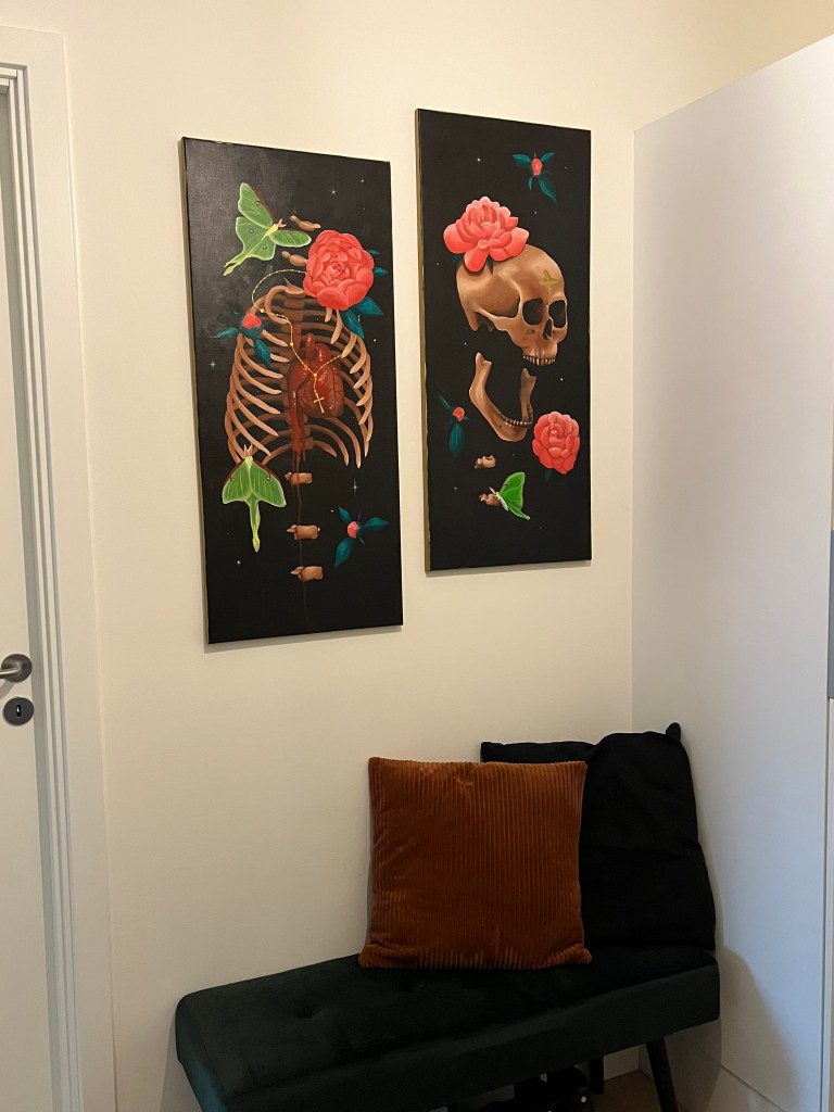
I thought it might be fun to walk through all the steps to my latest paintings – two tall canvases fully inspired by memento mori and remembering that everyone dies (even religion can’t save you from ending up 6 feet under).
If videos are more your speed, I have one that covers the process for “Headache” 🙂
Here is what I cover in this post:
- Planning + Inspiration
- Reference Creation
- Preparing the Canvas
- Oil Paint Layers
- Finished Piece & Varnish
Planning + Inspiration
I usually get a lot of inspiration for painting from music, but this time I was more focused on needing to furnish and decorate my new apartment. My white walls were begging for some dark colors! Memento mori is a huge component of my creativity, so naturally I needed to fill up these white walls with some skulls.
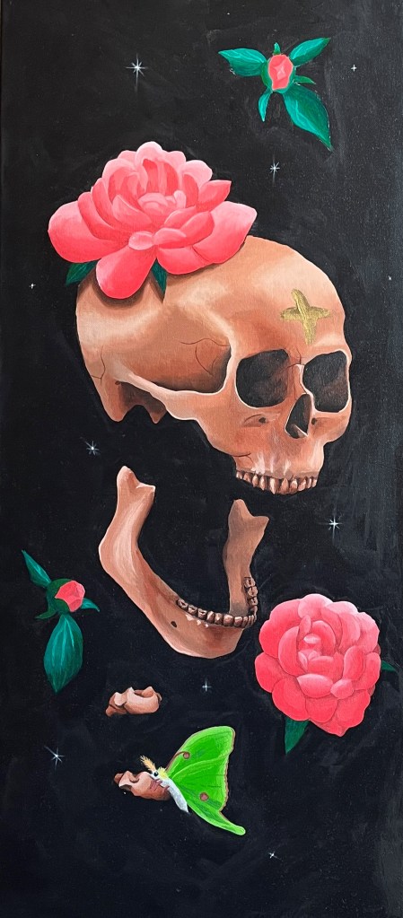
Memento mori is a Latin phrase, meaning something along the lines of “remember you have to die” or that “everyone must die”. The story behind these words are supposed to remind people that everything they have and do in life – wealth, luxuries, fame, power, success – all these things mean nothing in the afterlife. In the end we are all 6 feet under, both kings and slaves alike. Some classic memento mori painted items include: skulls, flowers, bubbles, gold coins, hourglass, anything to remind viewers they have a short lifespan.
Having two ideas and lots of white walls to cover, I ended up deciding on completing two canvases which compliment one another. When planning items out, I prefer to use my sketchbook as a planner with directions for future me. I usually use both drawings and words to keep track of the idea, being both a writer and artist I try to use both to my advantage when needed.
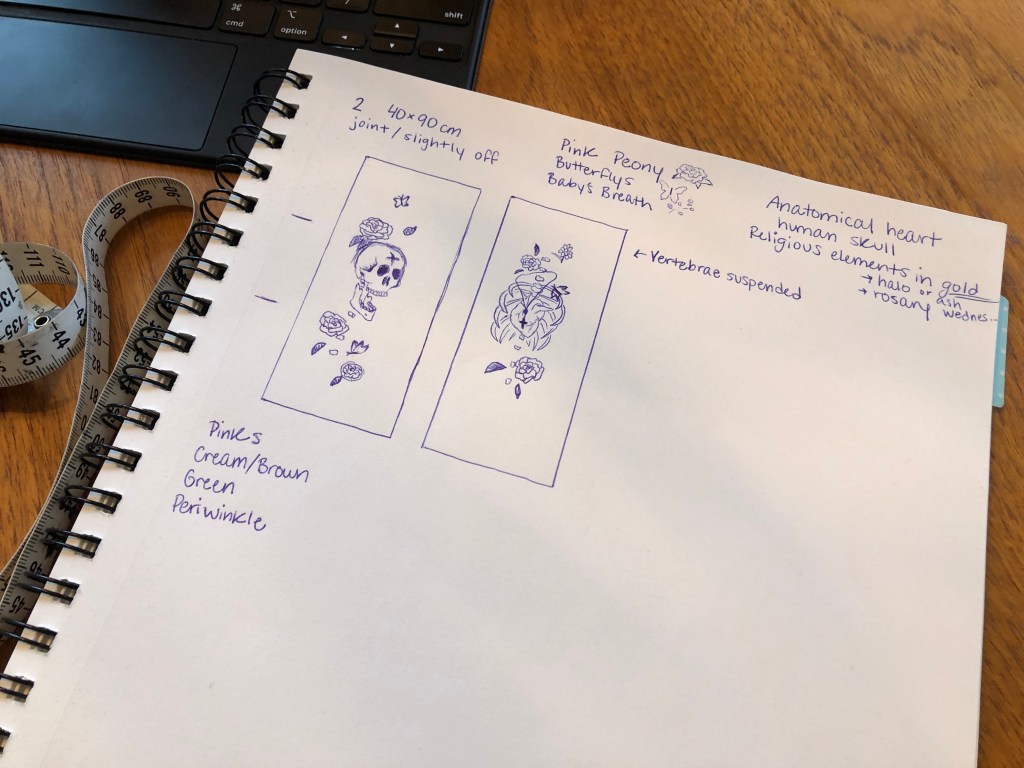
A good tip if you are a perfectionist like me: just get the idea out, it doesn’t matter if the first sketch is awful or even fully what you had in your head. This is also why I will use words when planning art, as you just need the idea out of your head in order to then improve it.
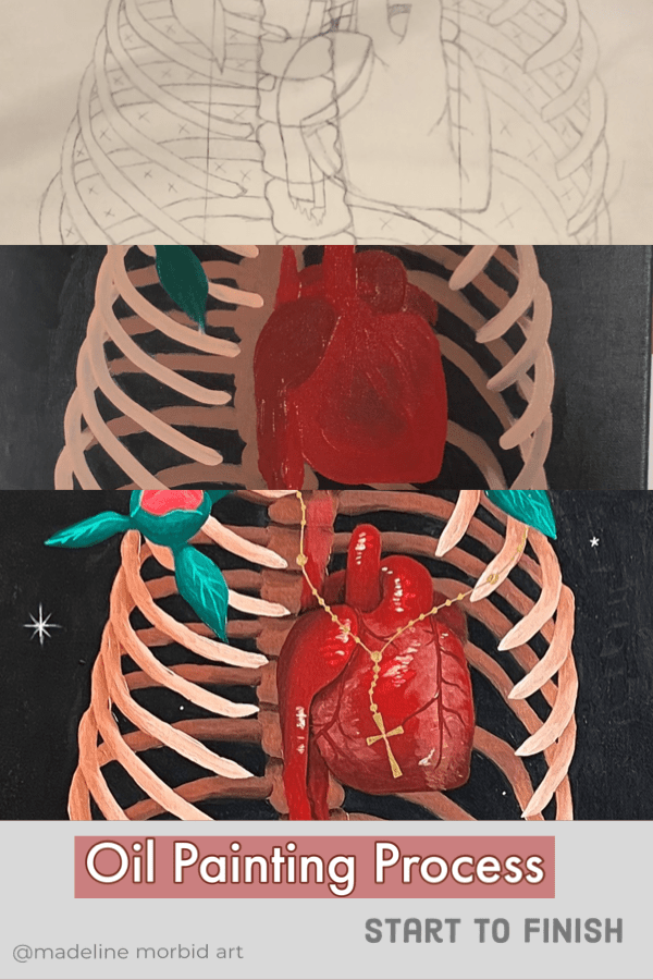
Another great advantage of using the sketchbook to plan is that you can test out new products and colors. I knew I wanted to use gold, for the more religious parts like the ash cross and rosary beads, though I haven’t used gold for oil paints before. Therefore, it was a perfect opportunity to test out the all the golds I had with different base colors.
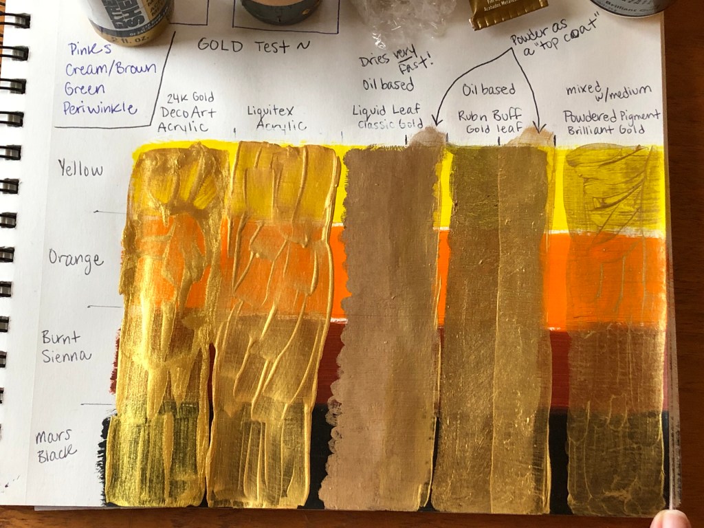
I decided for this piece to use the black base with the rub n buff gold leaf, but now I will always have this as a reference for future artworks!
Reference Creation
I like to photo-bash for my references, it cuts down on sketching times and allows me to see the rough look of the full painting all at once before putting down paint. I use procreate to manipulate photos and also draw. I love to take my own reference photos when possible – it is actually much quicker than scrolling Pinterest forever to try and find what is in my head. Although I do not have access to a skull or rib cage, so for somethings a google search is needed.
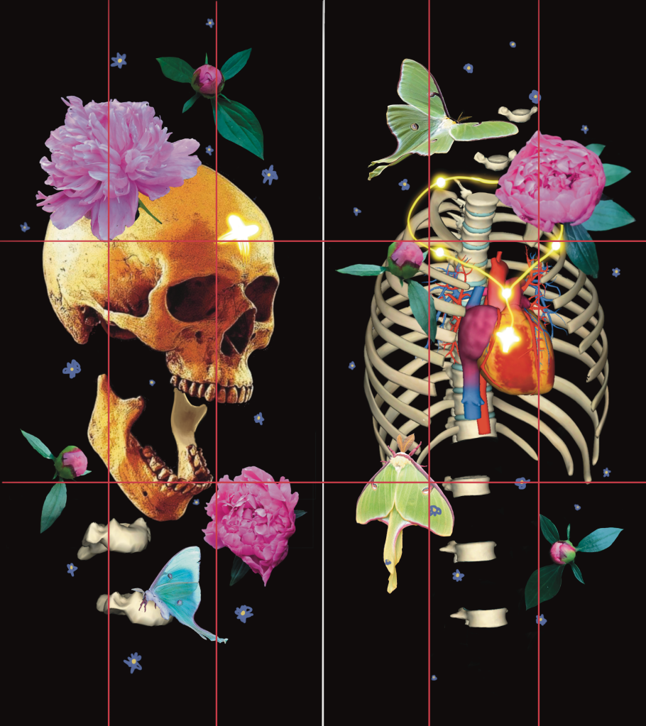
I take photos of beautiful flowers whenever I see them because you never know when it can be fit into a painting! I was not able to find a reference photo of the ribcage at the perfect angle so I ended up using an anatomical app which allowed me to pose the skeleton structures myself. The app is called 3D Anatomy Learning (Apple store, Google play), and as of January 2023 it is free. I will definitely be using this app again!
Preparing the Canvas
The first thing to do with premade canvas is to complete the stretch of the fabric. The tiny pieces of wood that come with canvases from the art store are there for a purpose – to hammer into the edges of the wooden frame. This tightens the fabric, so that it is less bouncy and flimsy while painting.
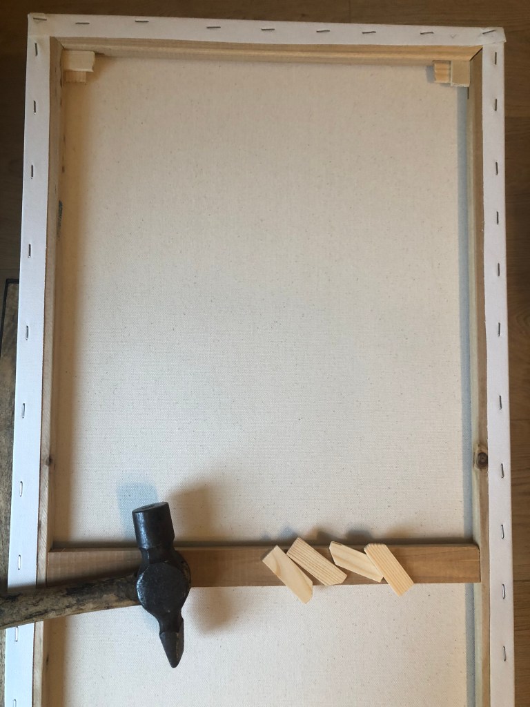

Since I bought cheap canvas I took an extra step of giving it two more coats of gesso in order to have a better surface area to paint on. I scooped the gesso on to the canvas then spread it out with a hard piece of plastic, trying to keep it even but allowing a little bit of texture (personal preference). This makes the surface I am painting smoother, which allows the oil paints to glide better and go exactly where I intend.
If you need help figuring out the supplies for oil painting check out this post for budget friendly options.
Once the gesso is dried, I sketch out the plan on the canvas. In order to better help proportions when drawing, I create a grid on both my reference photo and the canvas. This grid technique breaks up the large image into smaller ones, which allow you to focus on a smaller more manageable area to sketch instead of the whole thing all at once.


I prefer sketching on canvas with a basic ink pen – black or blue. Once the pen ink dries it won’t mix or muddy the oil paints like a pencil or charcoal will. The only downside is if you mess up, the sketch is still in pen so you cannot erase. During sketching the skull I messed up the proportion of the top half of the skull – which is why there is the line below the top portion to remind me when painting to bring it down. It is a good idea to use the sketch as a loose outline when painting and not as strict guidelines. No one is going to see your sketch under the painting (unless you share it like me), so let the sketch be messy!
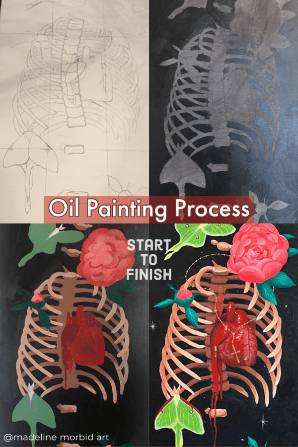
Oil Paint Layers
1st – Tone the Canvas
The very first layer before anything else is to tone the canvas – I usually use burnt umber, but this time I tried out mars black. This layer is just a couple dots of oil paint, spread out with a rag soaked in odorless mineral spirit. The point of toning your canvas before applying color is so that you can see when you apply light colors. This also allows for you to better see colors relationships as you apply color – everything looks dark when applied to white, but when colors are applied to a medium tone it is easier to tell lights from darks.

2nd – Quick Base Colors
Next, I mix up some basic lights and darks for each item I’m painting. For the skull painting I mixed three to four tones for each color – light, medium, dark, darkest. This first layer of actual color is part oil paint, part medium (Liquin Original by Winsor & Newton), part odorless mineral spirit. The main goal is to just get the correct color placed where it should be, but I also like to keep in mind light source during this step so that later steps are easier.
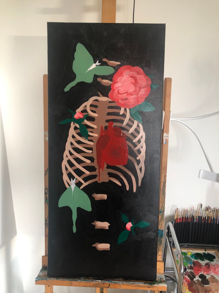
For the rib cage painting I did things a little differently. I painted all the black first, in order to clearly label where each rib bone was. Then once the black was dried, I went in with the first layer of color. In an effort to not be a perfectionist, I only mixed two colors for each item- a light and a dark. This allowed me to paint the first layer of the ribs canvas much quicker than the first layer of the skull piece.

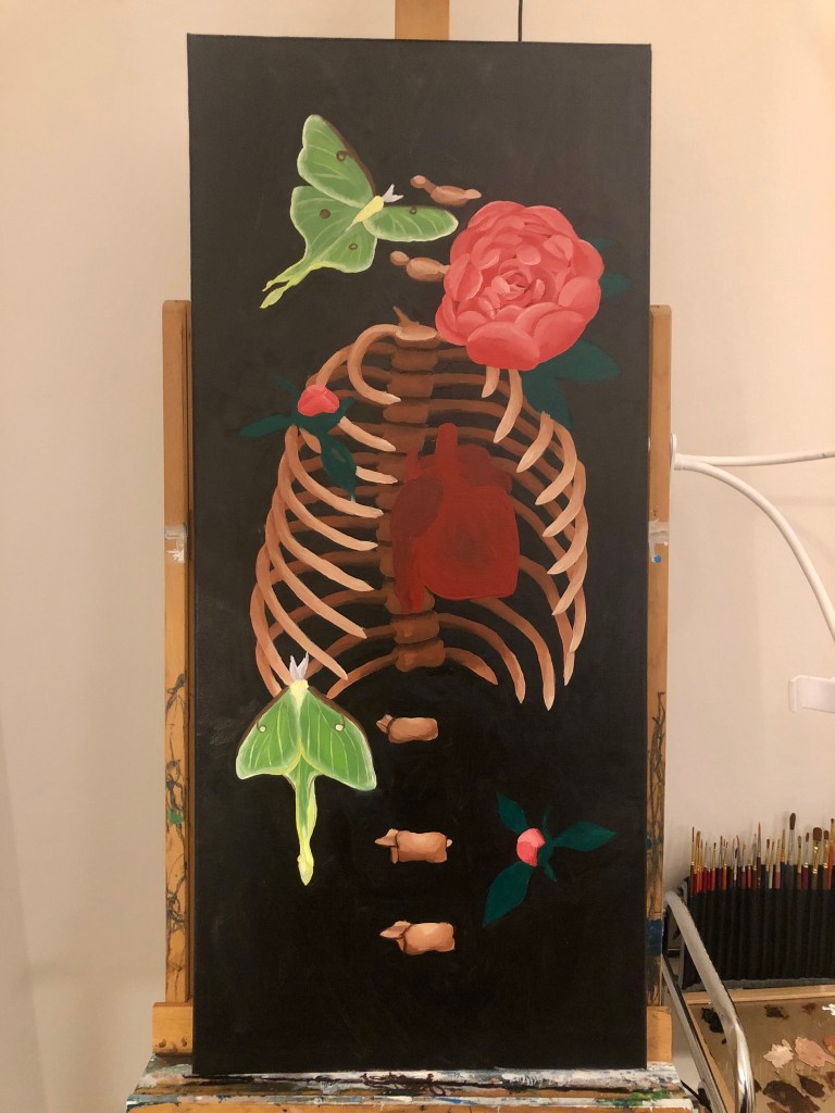
3rd – Detailed Colors
Once the base colors are dried, I began to focus on each element to give it more detail and focus on ‘sculpting’ it into a 3D shape. I try to keep in mind the light source when adding the darker and lighter colors.

Taking things slow is quite alright with oil painting, as each layer needs a few hours to dry. And by working in layers, if you ever mess up its possible to wipe away the current layer without destroying the whole painting!
4th – Highlights and Final Details
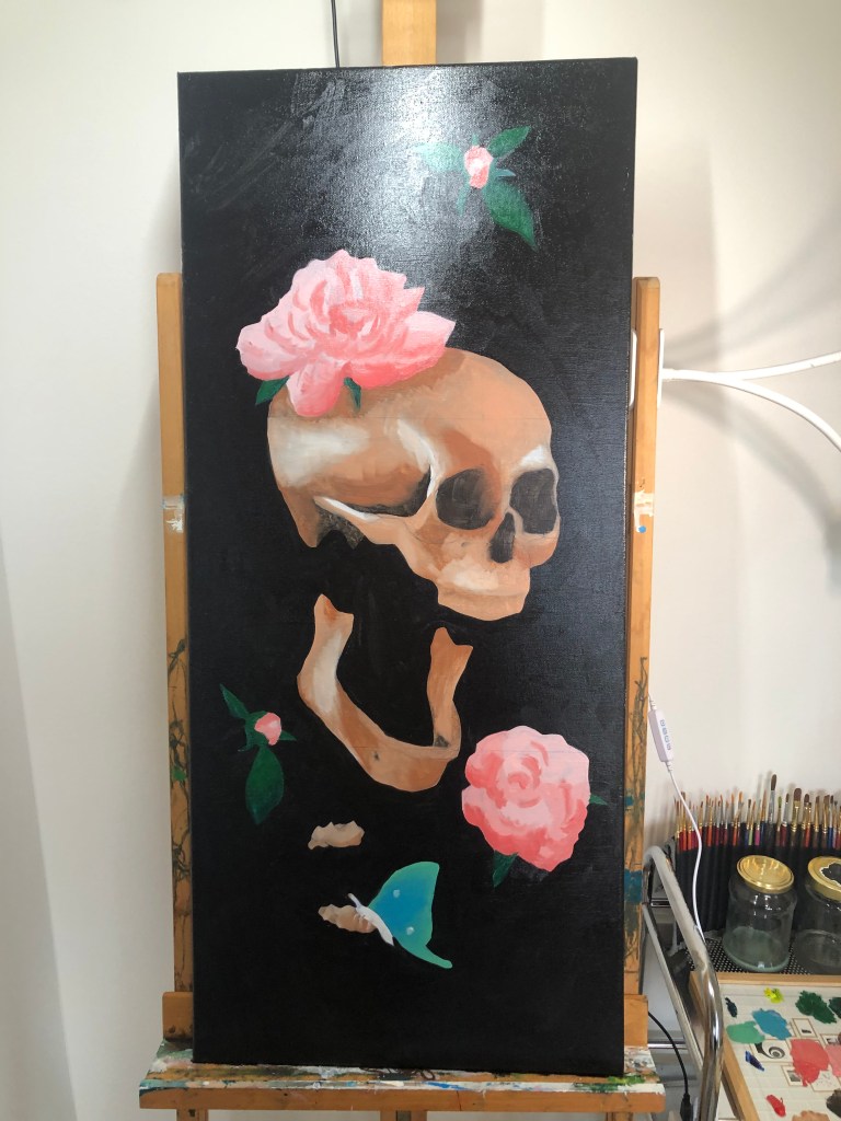
Originally I planned to add small flowers, but after seeing the painting in front of me – I felt it was in need of stars instead. So little tiny white stars in various start shapes – some dots, some five point, some more twinkle like. I also added the final fun element – gold! Including painting the edges of the canvas gold, as a DIY painting ‘frame’.
I would like to officially introduce… *drum roll*
“Headache” (2023) oil on canvas, 40 cm x 90 cm
“Heartache” (2023) oil on canvas, 40 cm x 90 cm

Finished Piece & Varnish
I like to give my paintings about 6 months of drying before I put the final layer on – varnish. This is like a top coat for your painting which seals in and protects all the layers below. It is imperative to have every layer fully dried before sealing with a varnish (beyond even just dry to the touch). This means I will be varnishing these finished works in late summer 2023 – so I will update then! For now the paintings have some spots of matte and spots of shiny gloss – but that will be fixed and all one solid glossy piece when varnished.
I am quite happy to finally have something on my bare white apartment walls!
I hope this breakdown was helpful, and maybe even a little bit inspiring. Please let me know if there are other parts of an oil painting that would be good to cover in the future 🙂
-Madeline

Leave a comment